Case study · Gregory Jewellers
Ecommerce website
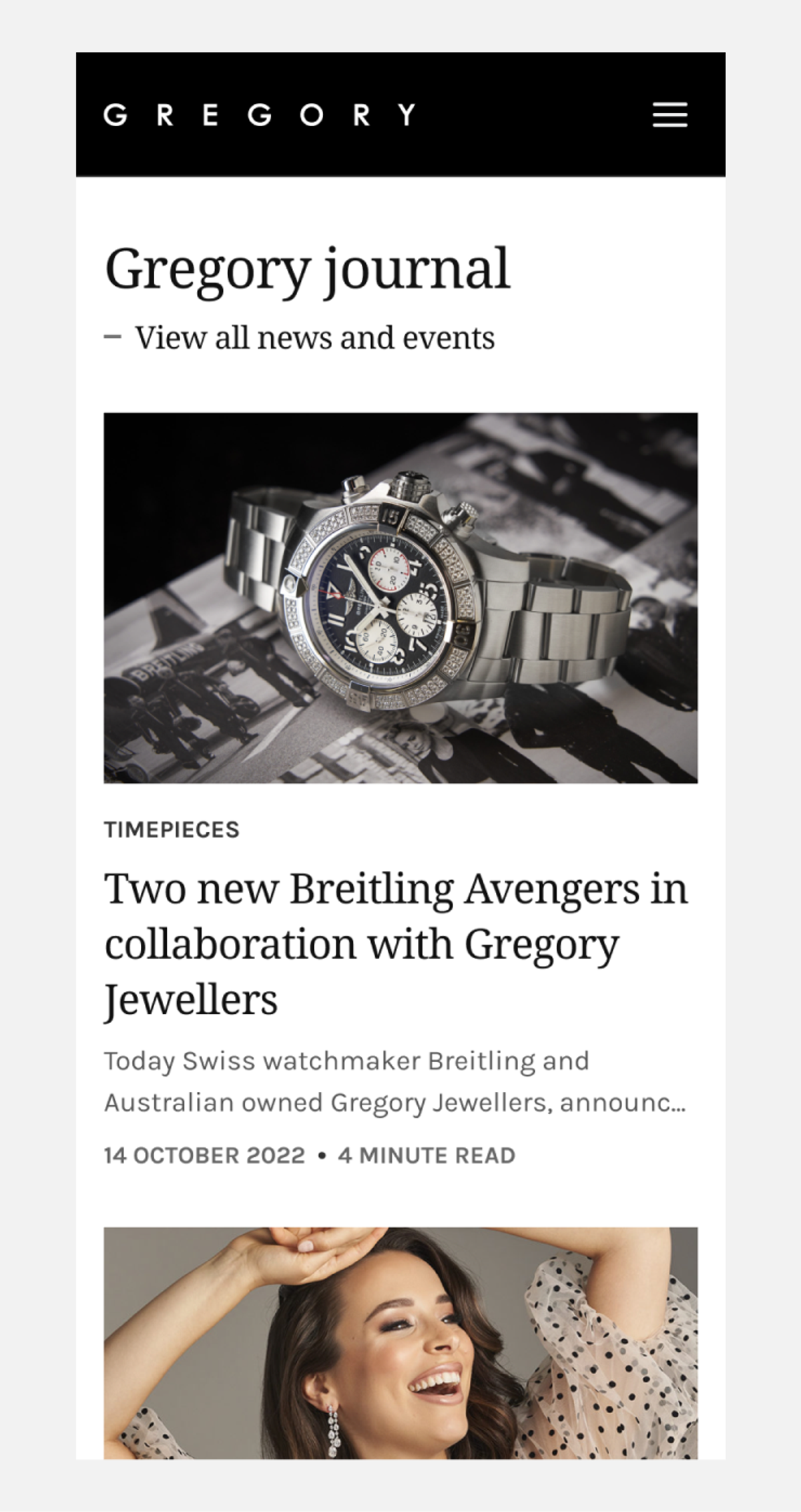
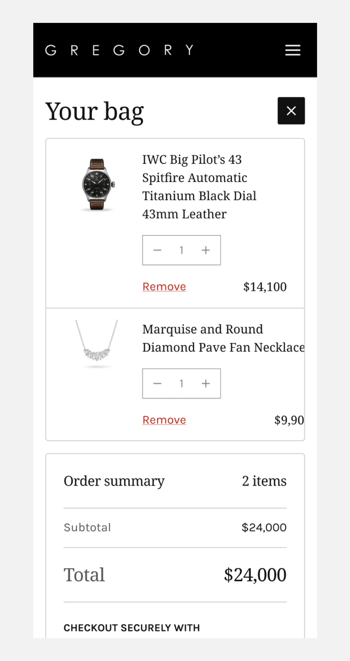
I designed ecommerce screens for Gregory Jewellers across desktop and mobile. The scope covered the home page, category listings, product details, colour selection, adding to bag, the cart and account sign in, plus the journal landing and article pages.
The brief covered browsing jewellery and watches through to selecting a product and reviewing a bag. The design needed to accommodate product imagery, prices, colour options and availability, with layouts for desktop and mobile.
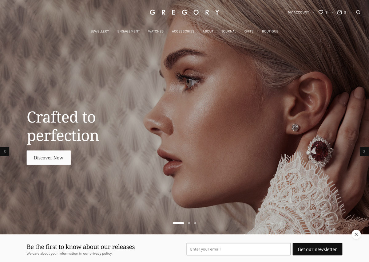
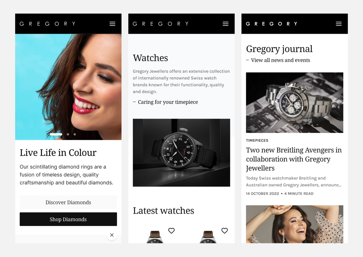
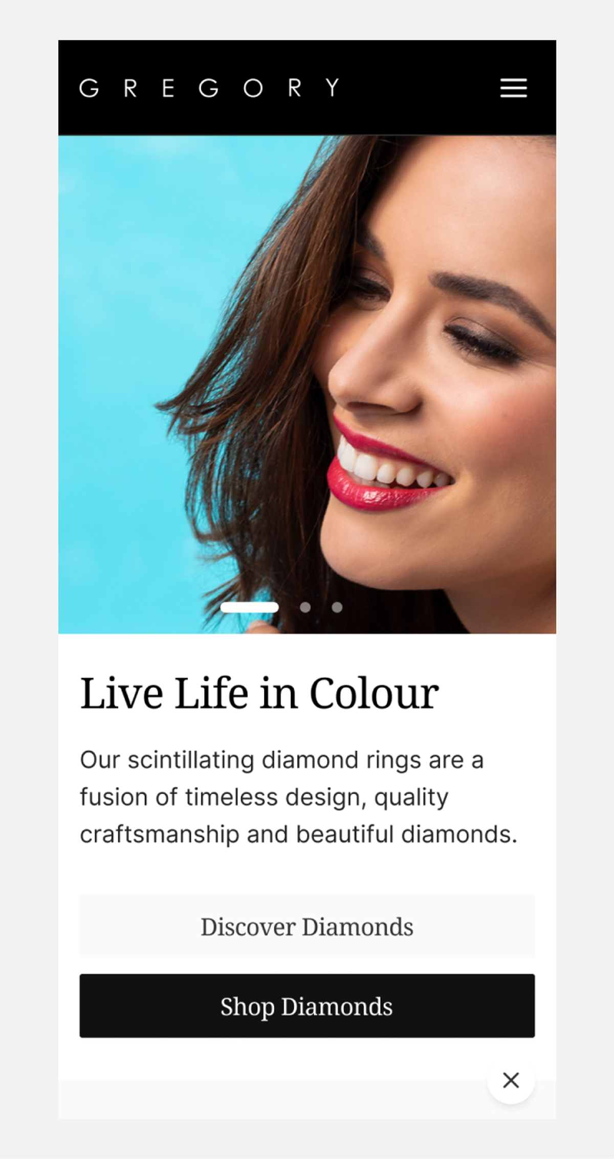
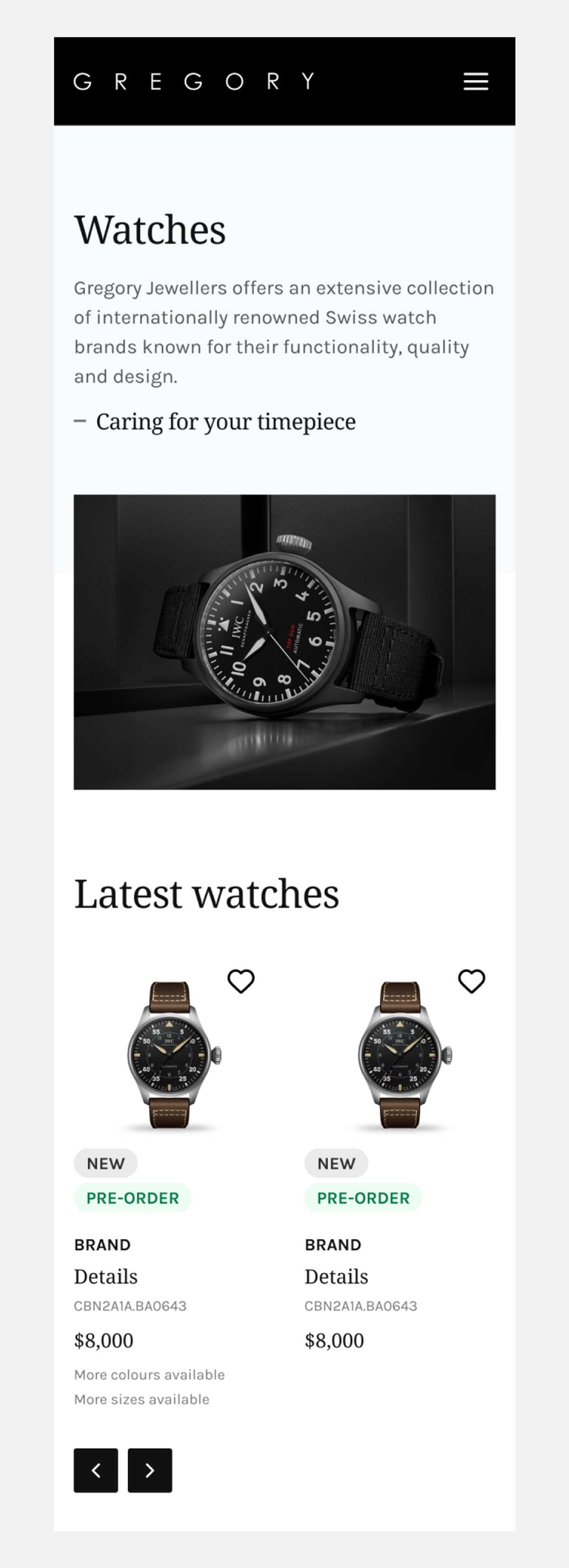
I designed the home page around campaign imagery and links to discover or shop. Category listings combine product cards with editorial features. Product cards pair imagery with names, prices and availability labels. Mobile browsing includes sorting and brand filters.
On product details, colour swatches sit alongside price and stock information. I designed the added to bag panel with item quantities and an order summary, plus a mobile cart layout. Account sign in appears as a panel on desktop and a separate view on mobile, with links to create an account or reset a password.
I also designed the journal landing and article pages for desktop and mobile. The landing presents image led story cards in a desktop grid and a single column on mobile. Article layouts bring together headings, body copy and imagery.