Case study · BreastScreen Victoria
Login journey redesign
BreastScreen Victoria offers free screening every two years to women aged 40 and over. My BreastScreen is where they log in to book, manage and track those appointments. We redesigned the login journey so anyone eligible can find their way in, not only those who already hold an invitation.
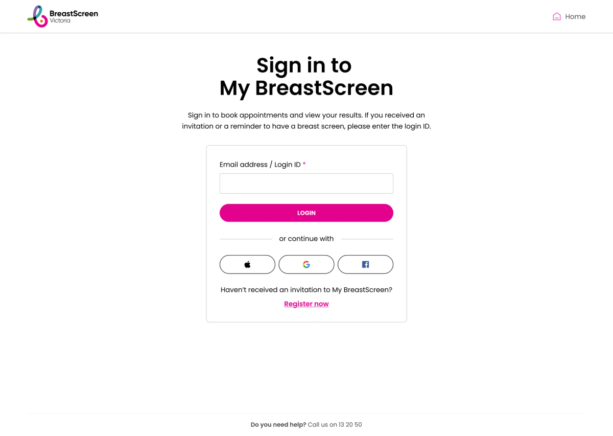
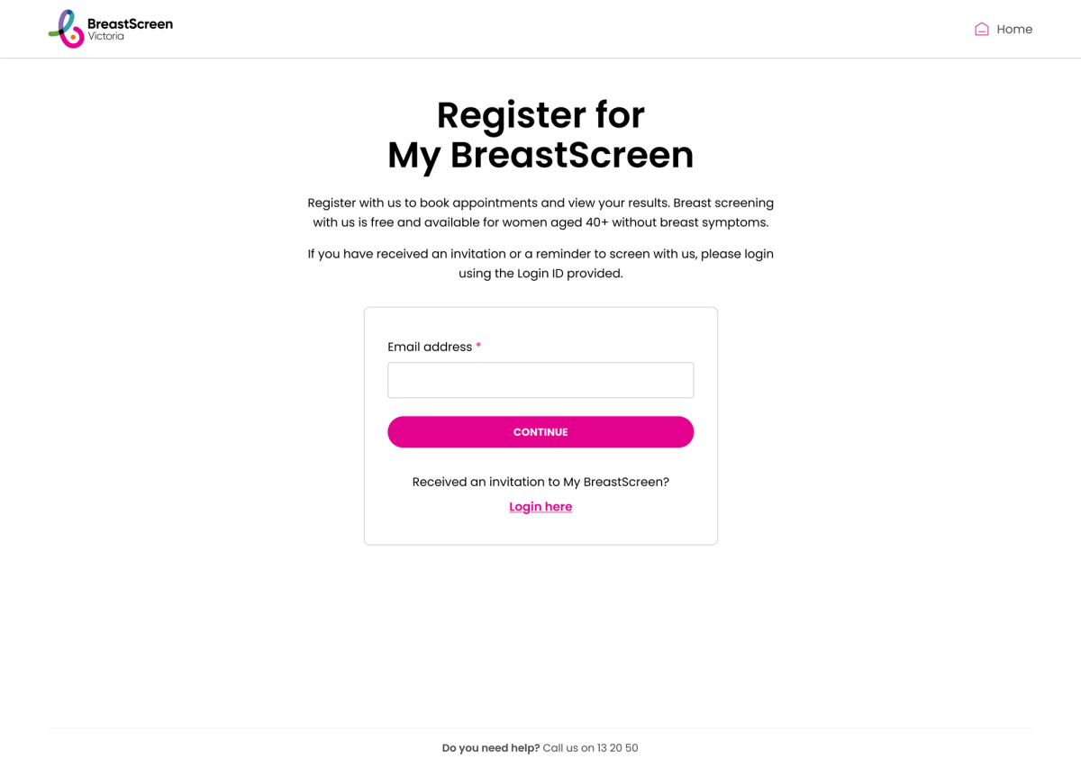
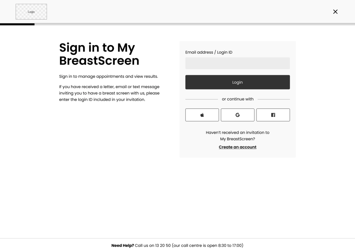
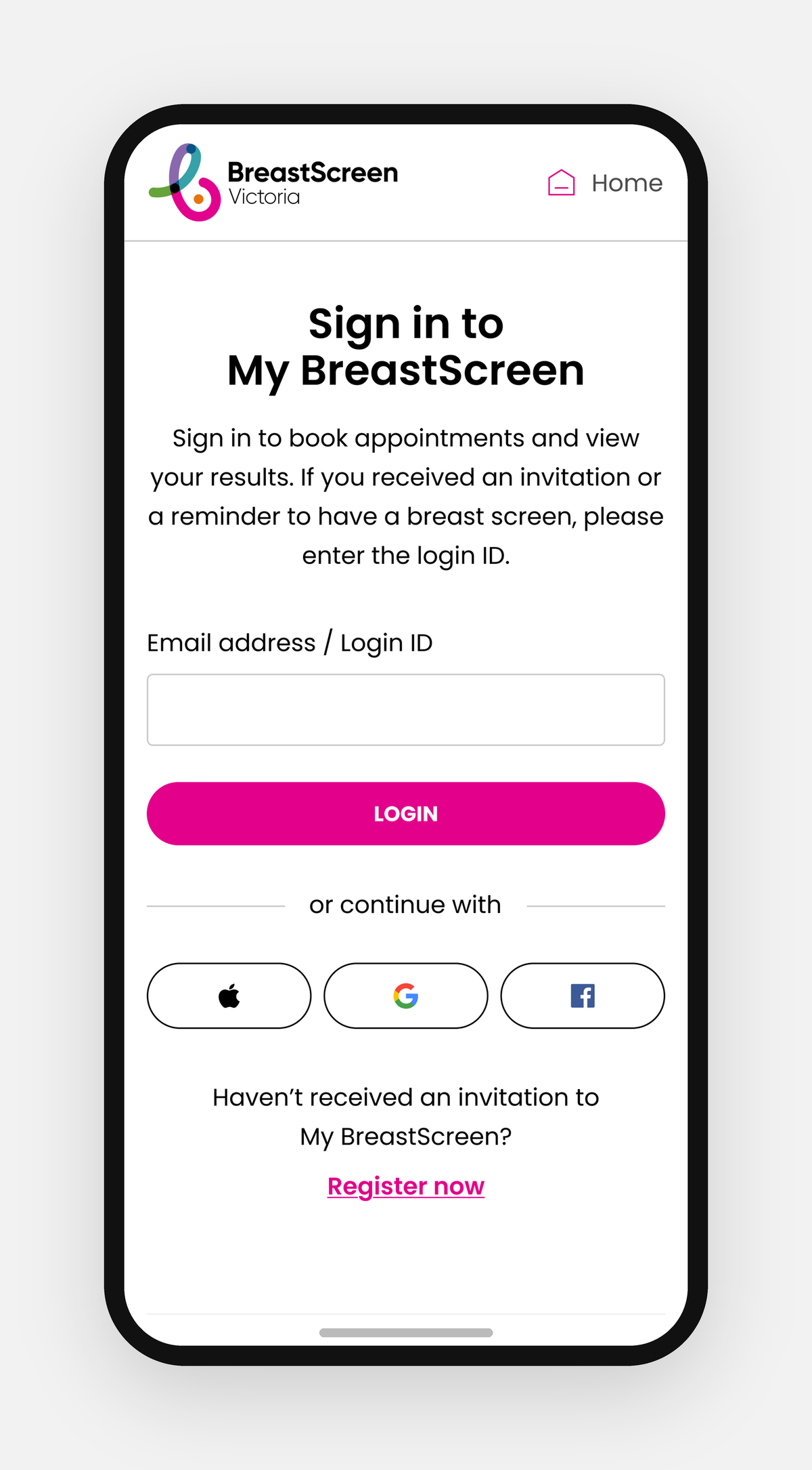
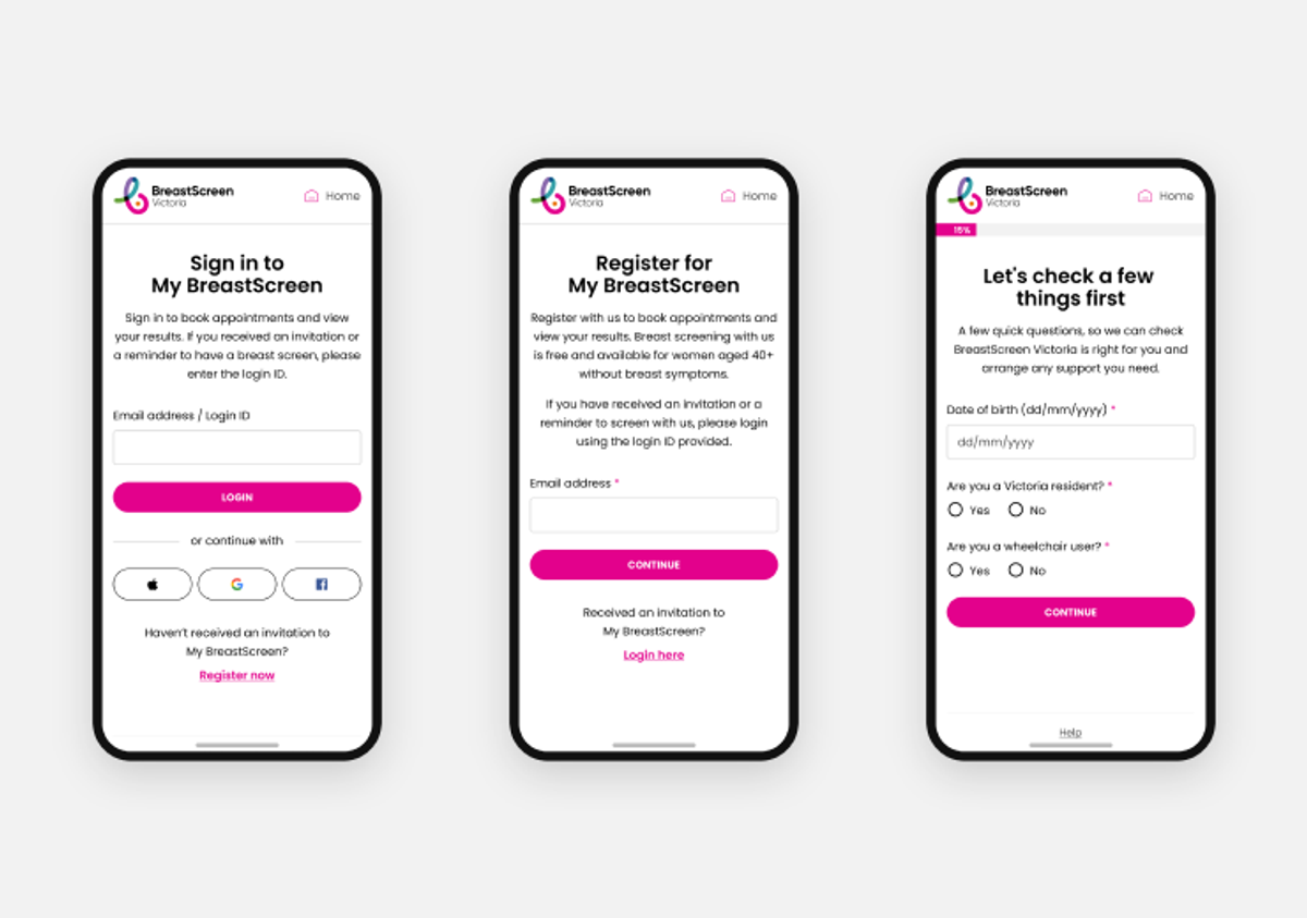
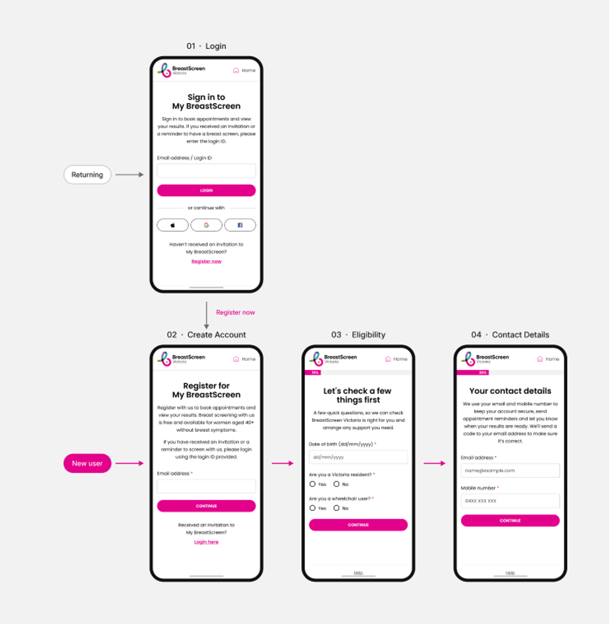
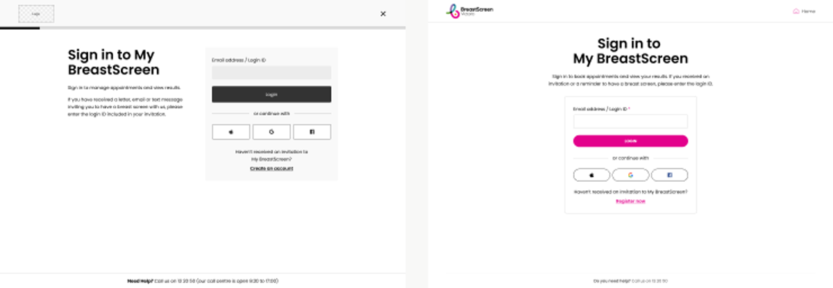
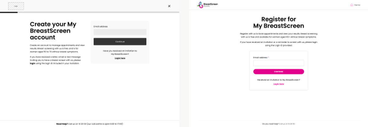
Login used to be invite only. If you hadn’t received a letter, there was no clear way to create an account, check whether you were eligible, or trust that a health service was asking for the right details.
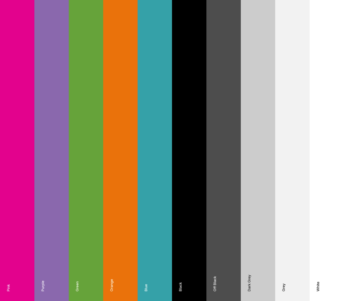
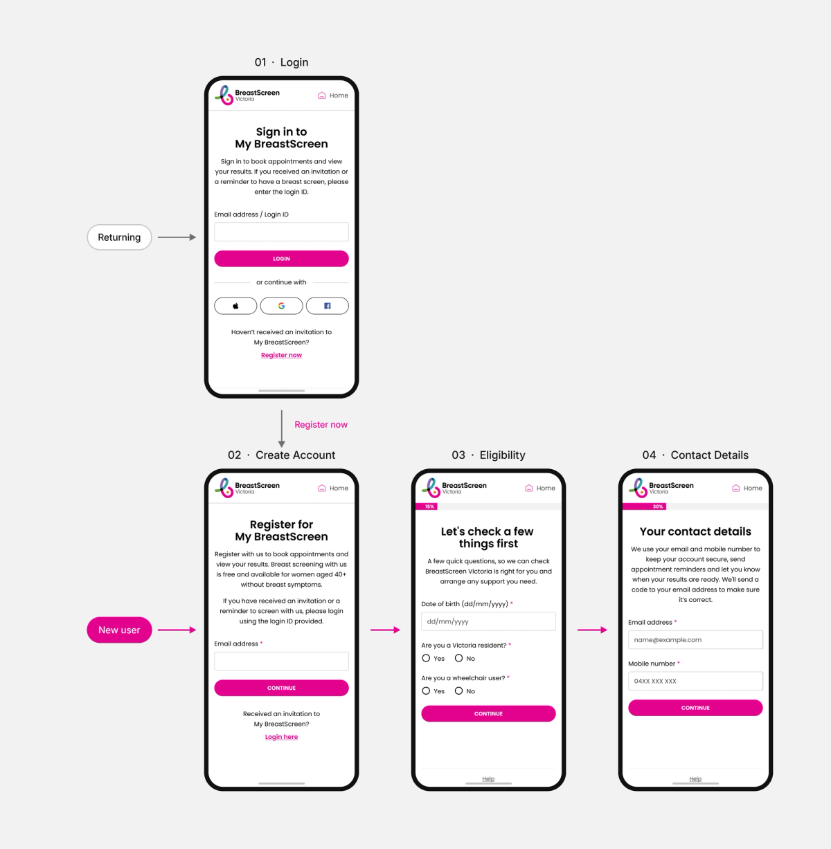
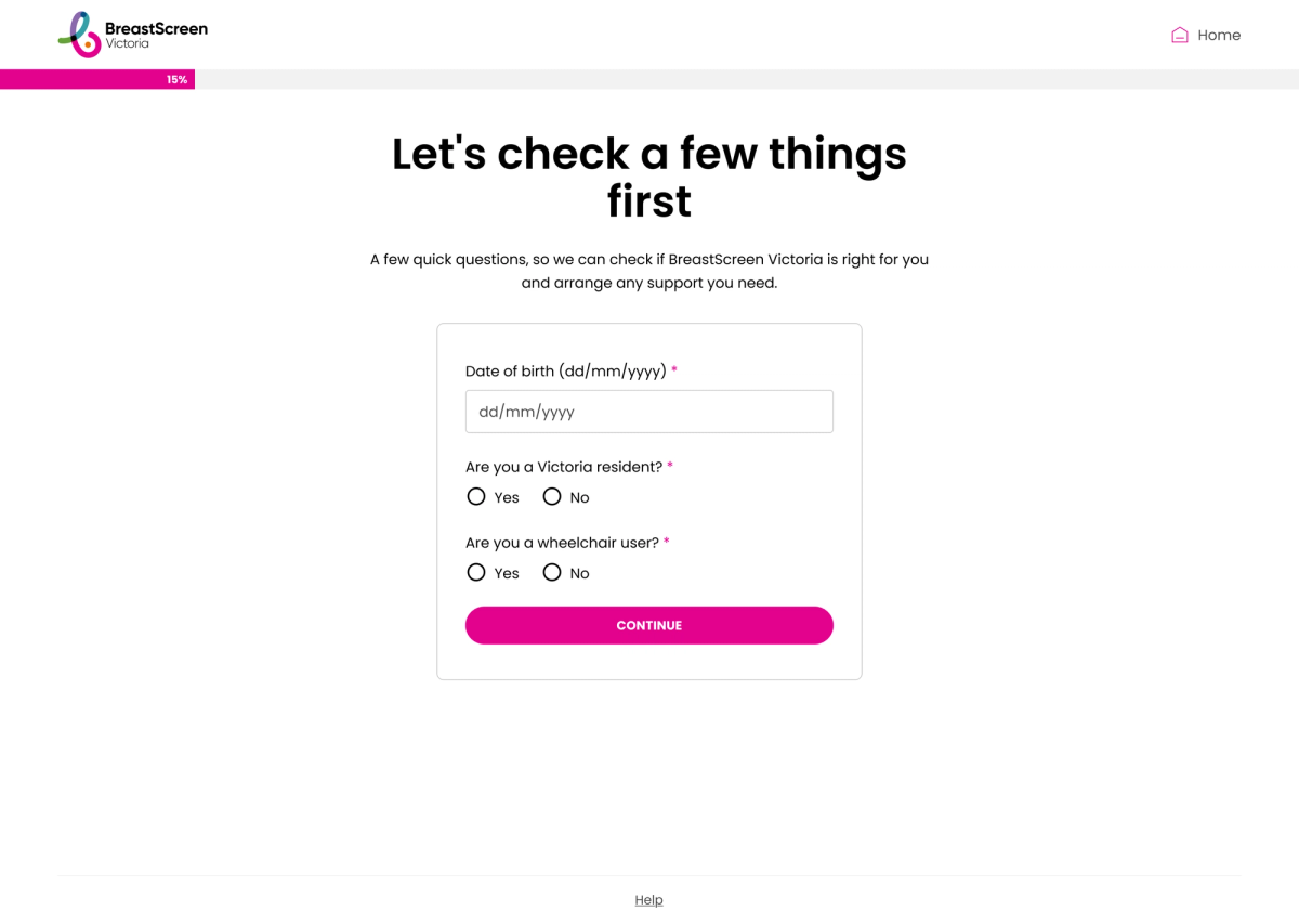
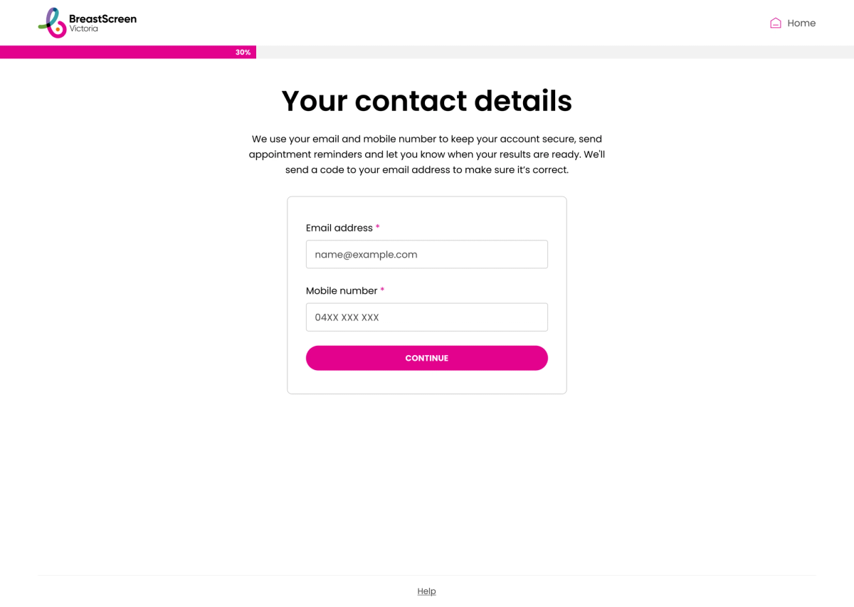
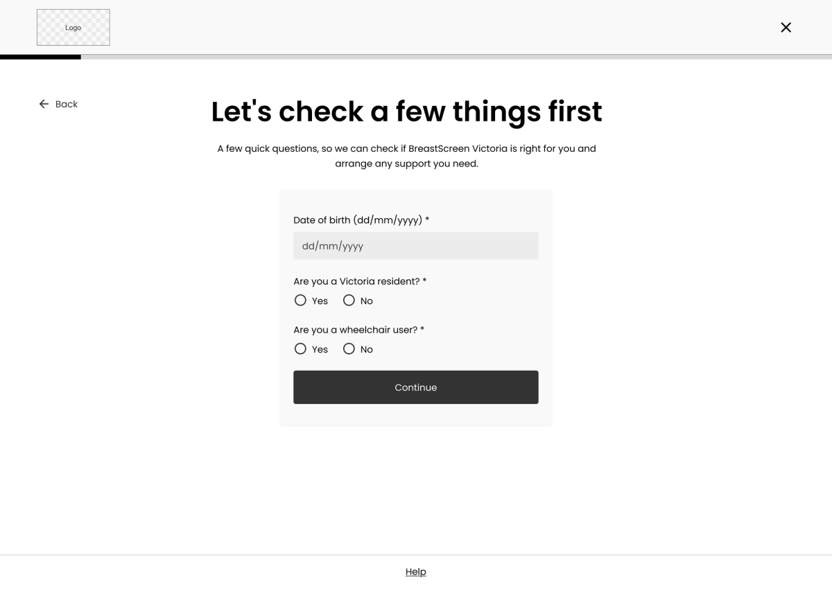
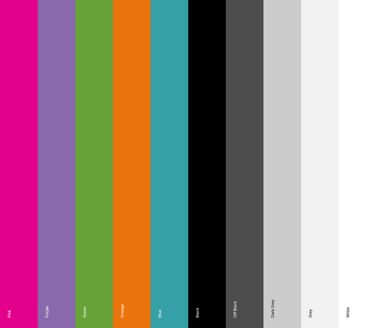
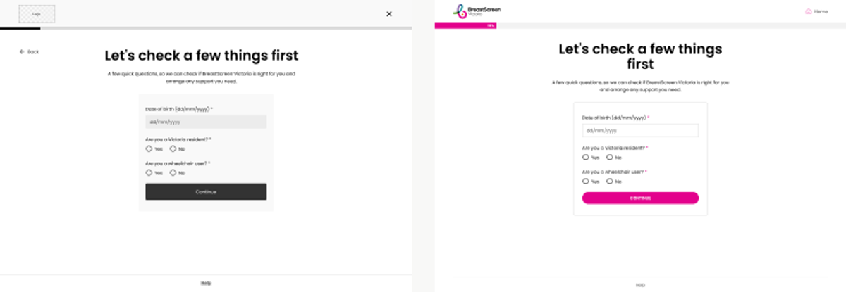
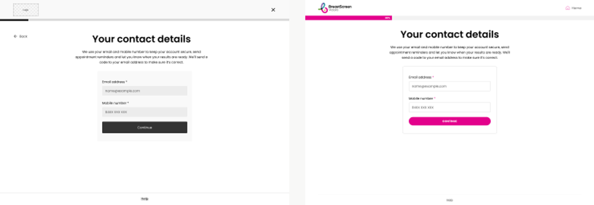
We split the journey at the first screen. Returning users log straight in. New users are guided through eligibility before they are ever asked to create an account. Plain language, calm hierarchy, and BreastScreen’s pink kept for moments that matter.
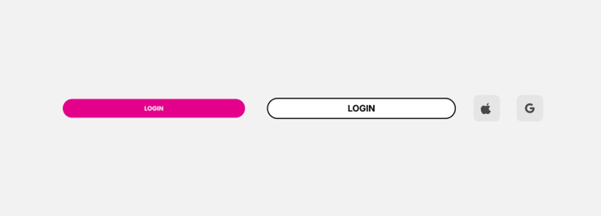
From research and flows to wireframes, UI, a component kit and device prototypes, every screen was tested against one question: does she know what happens next?